Given a sprint period of 5 days, our group of four designers were tasked with evaluating and improving Sea Shepherd's homepage and donation experience
My Role: UX research, Design Strategy, UI
Team: Group
Duration: June 2023, 5 days
Tools: Figma
Designed For: Desktop
The problem space
Introduction
The goal was to help this organization express their value and inspire people to take action in order to drive positive change, thus we evaluated the usability of the organization's landing page and donation experience.
The Research
Initial Research
Further Research
- People don't trust how their donations and contributions will be used.
- People stop donating to charities because they feel disconnected to the problem.
- People 25-34 make up only 12% of donations to charities in Canada.
- 12% of donors don't trust organizations to spend their money well
- 4% of organizations display where contributions go on the homepage
- 60% of people stop donating due to lack of emotional connection to the charity
Focus on Heuristics
Users faced Heuristic barriers in the category of Aesthetic and Minimal design. There were too many tabs to click on at the top, and the text was too thin against the background of the hero image to read clearly.
User testing
We conducted 5 user interviews with Canadians aged 25 - 34. We chose this age group as we found only 12% of them report donating to charities.
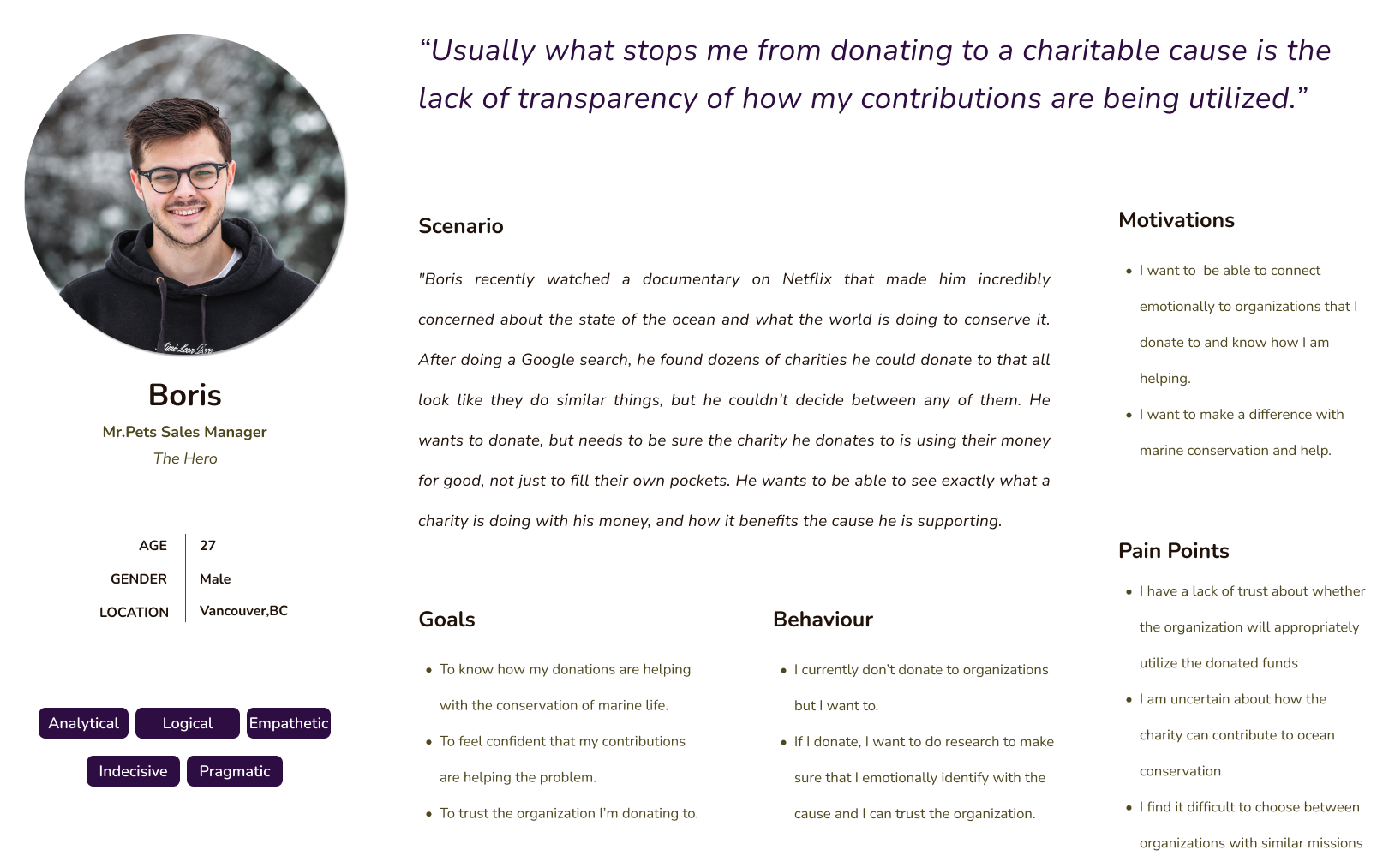
We found that donors have a lack of trust in how organizations will use funds, and they only donate to organizations they feel connected to and trust how donations are used.
How might we statement
Throughout all of our research, we came across a common theme - "Trust"
"How might we help Canadian donors trust Sea Shepherd in order to increase feelings of confidence when donating? "
Persona

Creating a solution
UI Inspiration
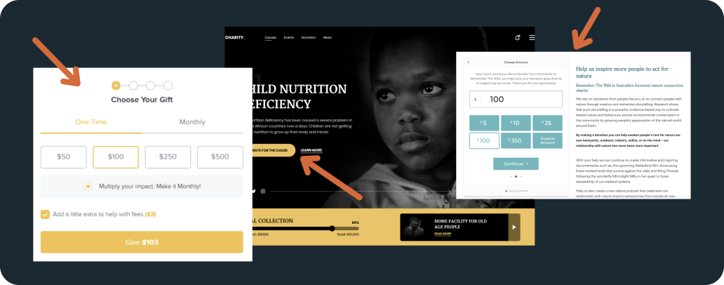
Key components that we've used from the UI Inspiration Board

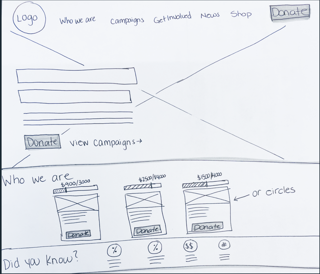
Solution Sketches


UI Library
To keep our wireframes consistent, we created a UI Library

Final Prototype
Next Steps
Given more time, we would have....
- Created an app to supplement the web donation process
- Further fleshed out the "Get Involved section"
- Created an e-commerce experience within the site
Selected Works

Sea Shepherd - Website RedesignDonation page redesign

EA - Hackathon Project24hr Hackathon

LIBERCapstone Project Case Study
